Balancing Shape: Contour-First vs. Value-First Sketching
The question of balance
Balance in a composition is not a single thing; it involves how visual weight distributes across a page, how edges meet space, and how contrasts guide the eye. Two common thumbnail methods—contour-first and value-first—approach balance from different starting points. This note compares them as practical studio options, with exercises to test each method’s tendencies.
Contour-first: edge and silhouette
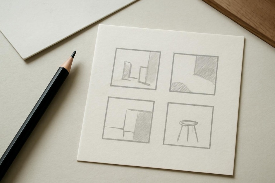
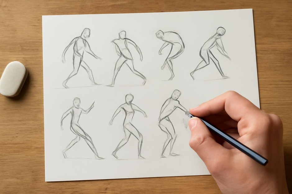
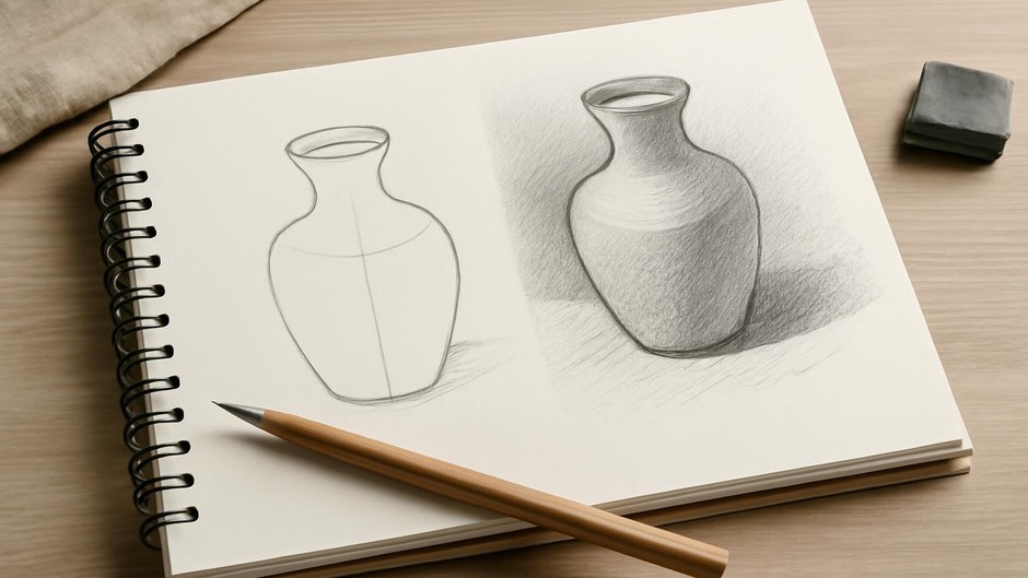
Contour-first thumbnails emphasize outlines and the relationship of forms via their edges. The focus is on silhouette, overlap, and negative shapes created between objects.
- How it trains balance: By attending to edge-to-edge relationships, contour-first work highlights how shapes nest and counterbalance each other.
- Typical outcome: Drawings with clear, readable silhouettes and a sensitivity to adjacency and gap shapes.
- Potential limitation: Tendency to underplay broad tonal mass if values are added later without rethinking balance.
Value-first: mass and weight
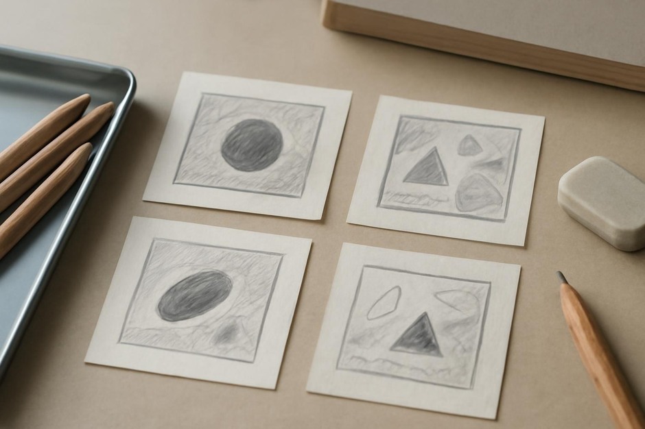
Value-first thumbnails start with large tonal areas. The aim is to establish light and dark masses quickly to see where visual weight lies.
- How it trains balance: Value-first work makes global weight distribution evident from the beginning, encouraging decisions about where the eye will settle.
- Typical outcome: Strong sense of volume and weight, with clear contrast hierarchies.
- Potential limitation: Outline and edge clarity may be secondary, which can lead to ambiguous contours if the drawing requires crisp shapes.
Exercises to compare
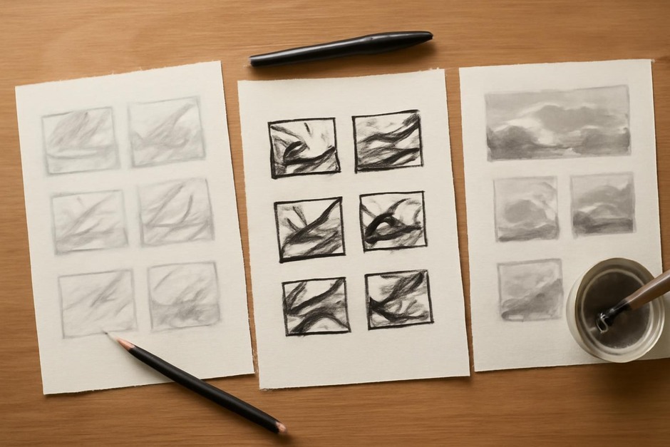
Set a timer for three sets of ten minutes, alternating methods.
- Set A — Contour-first: Block silhouettes and refine overlaps. After five minutes, lightly indicate value without changing edges.
- Set B — Value-first: Establish three tonal masses: dark, mid, light. Then add minimal contour lines to indicate key forms.
- Set C — Hybrid: Begin with a single value block, then redraw major contours to see how edges shift when mass is present.
Reading the results
Look at which thumbnails feel stable and which feel unsettled. Contour-first drawings may feel balanced in form but reveal surprises when values are applied. Value-first thumbnails may feel heavy in the same place across different subjects, indicating a personal bias toward dark anchors.
Neither method is superior; each trains different faculties. Contour-first tuning increases sensitivity to edge and adjacency; value-first tuning strengthens tonal intuition and global balance. The most useful discovery is how these tendencies interact when combined: contour clarity can guide value placement, and confident tonal structure can support ambiguous contours with intention.
Practical note
Create a small pocket of thumbnails labeled with method and date. Over time, patterns emerge—favorite anchors, habitual oversights, and moments when a hybrid approach resolves a compositional tension. Use these observations as prompts for further practice rather than as rules to obey.