White Space as Partner: Compositional Breath in Small Studies
Seeing the spaces between
Negative space—often called white space—functions like a silent companion to shape. In small studies, the proportion and placement of empty areas strongly affect rhythm, pacing, and a sense of balance. This studio note contrasts two ways of treating white space and offers short exercises to make the differences visible.
Framing-first: define the outer edge
Framing-first practice begins by establishing the page margins or an internal frame and then placing shapes within that boundary. The frame becomes an active constraint that clarifies relationships.
- Effect on balance: It makes the composition feel intentional and contained; every gap is measured against the frame.
- Typical habit: Artists see symmetry and alignment more readily when the frame is explicit.
- Consideration: Over-reliance on the frame can encourage centering and predictable layouts.
Interior-space-first: let shapes define gaps
Interior-space-first practice begins by drawing shapes with attention to the gaps they create between themselves, rather than in relation to an outer frame. The empty areas become emergent and often irregular.
- Effect on balance: It encourages dynamic, irregular spacing that can yield a livelier rhythm.
- Typical habit: Compositions may feel more organic and less constrained by page edges.
- Consideration: Without an outer reference, compositions can drift toward imbalance if not checked.
Exercises to explore white space
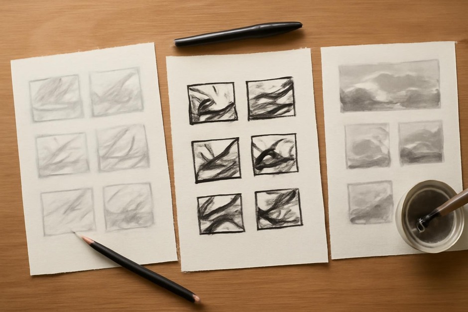
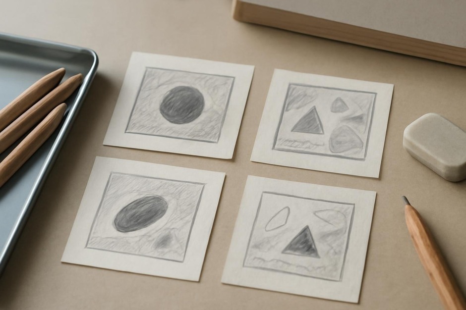
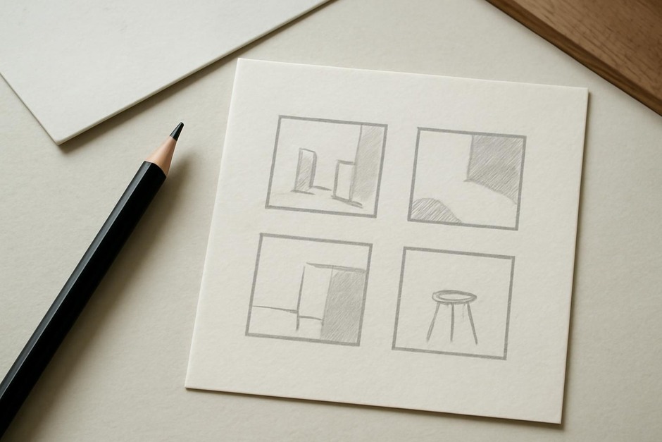
- Frame challenge: Mark a small rectangle in the corner of a page. Compose three thumbnails within that rectangle emphasizing different balances: left-heavy, centered, and counterbalanced with small shapes.
- Gap listening: Place three shapes without regard to the page edge. After each arrangement, trace the largest negative shapes that emerge and assess their rhythm.
- Swap and compare: Redraw one arrangement in the other method: take an interior-space sketch and transpose it into a framed layout, and vice versa.
Comparative observations
Framed thumbnails often read as deliberate and stable; they make hierarchy easier to establish. Interior-space-first thumbnails reveal subtler, more conversational rhythms between forms but may need a corrective glance to maintain balance. The practical advantage lies in alternating these modes: framing helps when clarity is needed, interior-space listening develops sensitivity to irregular beats that can enliven a composition.
White space is not absence but partner. By practicing both framing and interior-space strategies, you cultivate the ability to choose whether the page should support the shapes like a rehearsal hall or respond to them like an improvising musician.